|
|
Post by MorbidBirdy on Feb 27, 2008 21:25:55 GMT -6
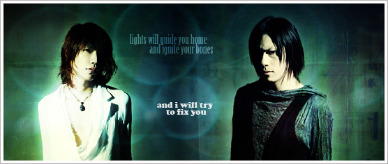
So i got the new layout up and am not for sure if i like it yet  lol it might take some time to get used to. anyway i wanted to know what you guys though Banner by J kong. **i know some of you said not to do white because it hurts the eyes, but i tried many other colors and it just didn't look as clean :/ ALSO i changed and moved around the name of boards and categories I kept lyrics from the song "Audrey' for the category names, but i picked better lyrics XP |
|
|
|
Post by freezing moon on Feb 27, 2008 22:52:26 GMT -6
Different, but I think it's prooty. And it's really not that hard to look at, even for something that is white.
|
|
|
|
Post by Onyx Marie Florencia on Feb 28, 2008 0:57:39 GMT -6
The one that appears before you login? Its beautiful.I think it looks very nice.Great job =D
|
|
giz
New

Posts: 16
|
Post by giz on Feb 28, 2008 2:49:37 GMT -6
I love it <3 I think it's much better than the past layout (it also helps that blue is my favorite color xD)
|
|
|
|
Post by Bleedingkyo on Feb 28, 2008 3:21:02 GMT -6
it's much better. May take some getting used to. But it's easier on the eyes.
|
|
|
|
Post by vanessahhh on Feb 28, 2008 3:22:46 GMT -6
well done, nice work on the new layout. i have to say i do like it a lot better.
|
|
|
|
Post by diany403 on Feb 28, 2008 4:04:51 GMT -6
it's really nice  |
|
|
|
Post by Lumisade on Feb 28, 2008 4:05:30 GMT -6
Really good job!
I think white bg and grey text is better than black and white, at least for my eyes. %)
|
|
|
|
Post by Melinen on Feb 28, 2008 5:23:38 GMT -6
I like it. ^^ The banner looks nice and white isn't as weird to look as I thought it would.
The new names & lyrics are nice, too! ^^
|
|
|
|
Post by nekochin on Feb 28, 2008 6:13:14 GMT -6
maybe its my computer, but i still see black all over, just like when i first join in, around 20ies february. but now i cant see some part, like the one on the upper right of the screen. usualy i can see greeting and how many message for me, but i cant find it now. plus there is white box everywhere, they used to be something inside it, like page options or "reply" button. help me someone? cos i really like this forum
|
|
|
|
Post by MorbidBirdy on Feb 28, 2008 8:07:45 GMT -6
hey thats really odd, can you take a screen cap of it?
also, you can pick which forum layout you want to use by changing the 'skin'
go to your profile - modify profile- and scroll half way down. it will have an otpion that says Select Skin: and a drop down menu. Make sure the skin is DEFAULT that you have selected.
|
|
|
|
Post by atypeofdeity on Feb 28, 2008 9:34:04 GMT -6
it´s better now^^ brighter and stuff<3
|
|
|
|
Post by lenin on Feb 28, 2008 9:55:30 GMT -6
um, great job!
|
|
|
|
Post by yuri on Feb 28, 2008 16:03:56 GMT -6
I like that it's a lot brighter and more easier to read. I can't honestly compare it to the last ones because I barely remember them as is, but I do really like the header a lot. Nice work! (^ù^)V
|
|
|
|
Post by whtevergoaway on Feb 28, 2008 20:11:11 GMT -6
WHOAAAA. I havn't been on here in ages. Nice layout  |
|